Doves Bindery book completed

Well, I changed my mind about having Yapp foredges. Just after posting the piece about the sprinkled edges I found a little packet of brass clasps that I had had made by a local jeweller about 20 years ago.

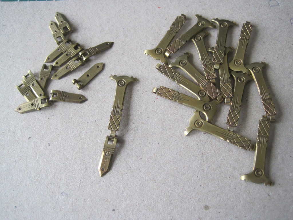
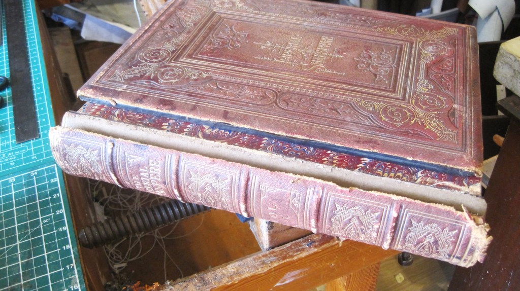
They are cast brass replicas of the silver clasps on a Victorian prayer book and were for a vanity project to make a dozen copies of a calligraphic handwritten book of poems. The project came to nothing but I kept that clasps (having paid for them myself) on the basis that I might use them one day. The length of the ‘hook’ piece, about 30mm means that the binding has to be more than that thickness, and by chance the Doves Bindery book is 35mm thick, from board edge to board edge.

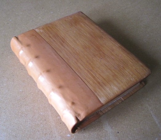
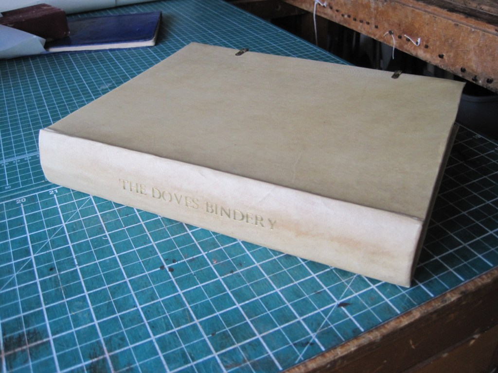
Furthermore, brass clasps on vellum bindings have a long history, their function being to hold the boards together either if the boards begin to bow outwards or the text, if parchment or vellum itself, should swell. And the Doves bindery did quite a lot of vellum bindings, though without ties or clasps. The vellum covers were usually undecorated, as it was felt that the vellum itself was beautiful enough. Who am I to argue!

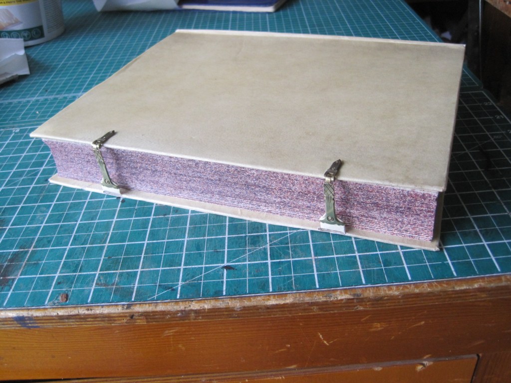
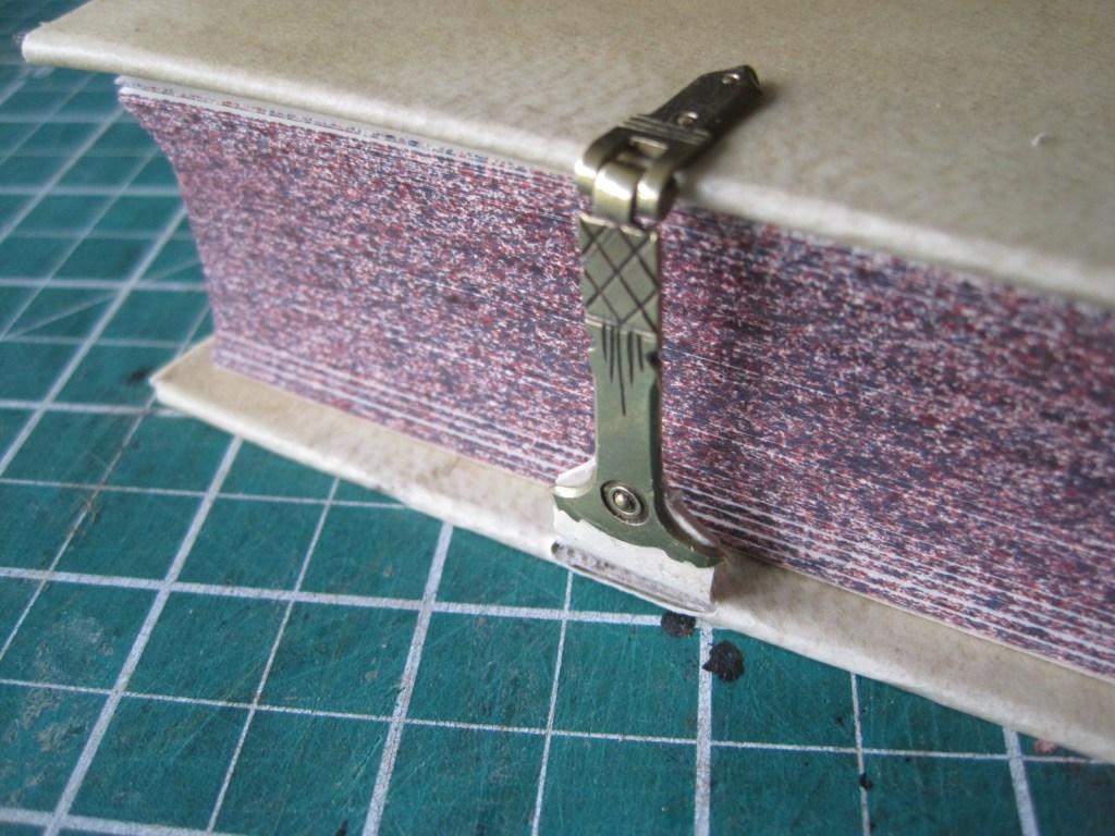
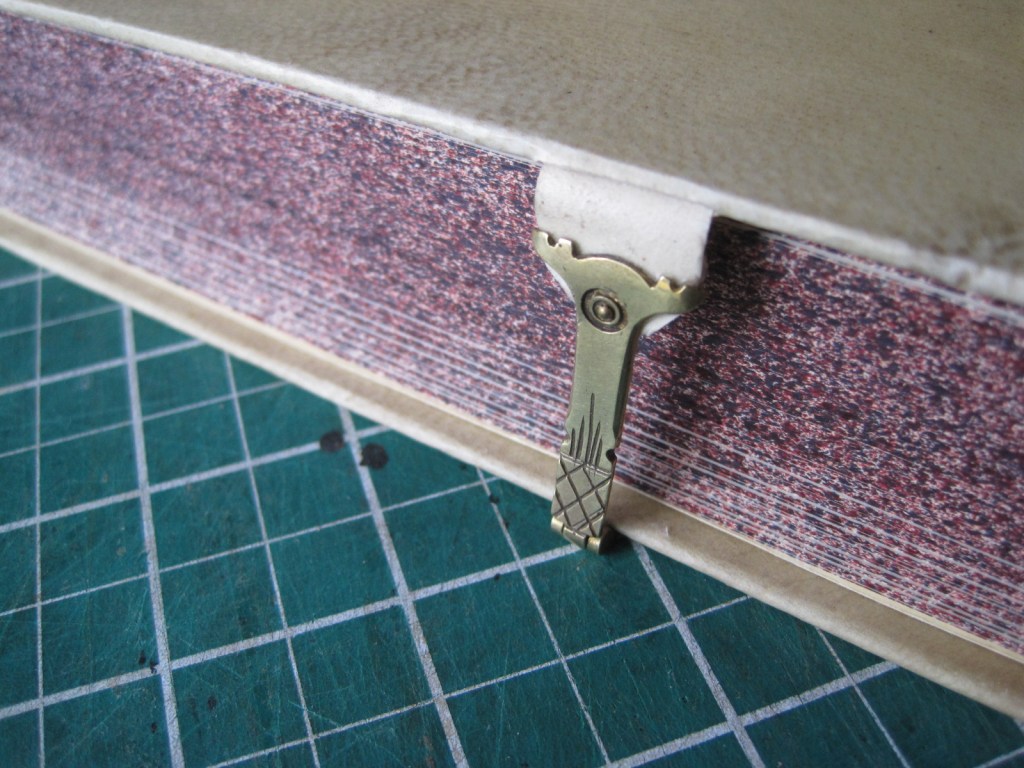
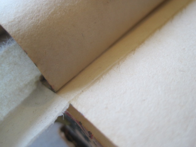
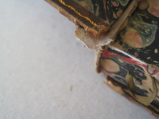
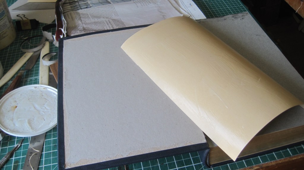
The strap, also vellum, is inset into the cover board and the foredge folded over it. I believe that will be sufficient, but it would be easy enough to nail it, from the outside, if it comes loose through use.

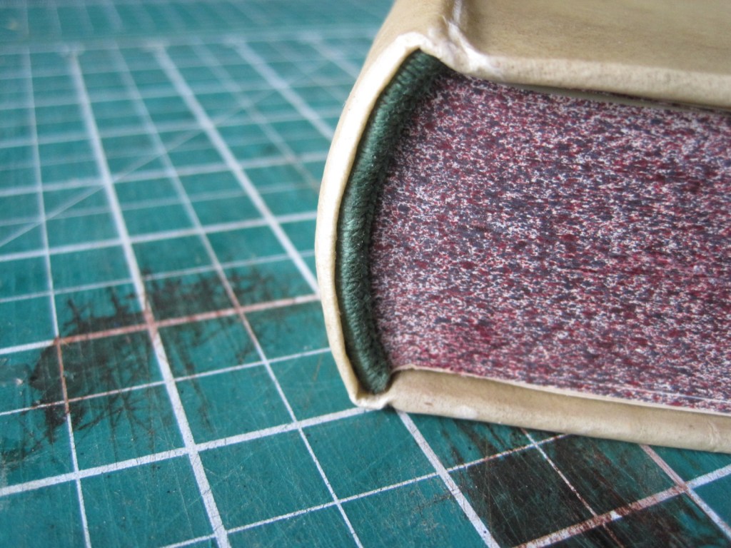
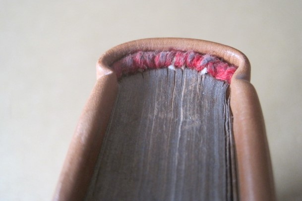
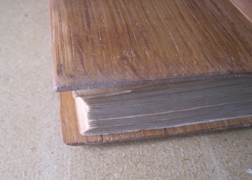
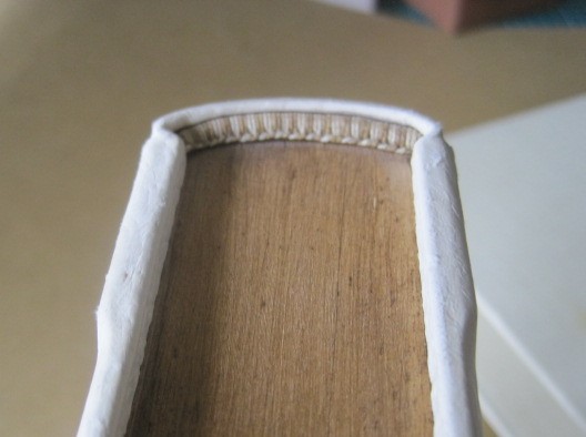
The head and tail have a very gentle headcap.

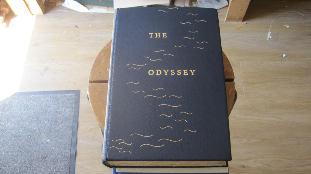
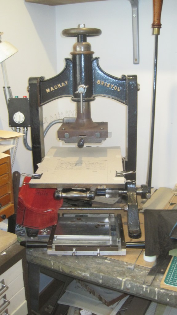
The spine was lettered with my blocking press before covering. Vellum has a hard surface and is difficult to tool by hand, especially with large letters, so the more powerful impression achieved with the blocking press ensures crisp even lettering.

If anyone is interested in buying the clasps, I will sell a few at £10 each (hook and clasp).

On the edge

A short piece about sprinkling edges: an earlier post describes my binding of the Marianne Tidcombe study of the Doves Bindery. In fact I had bought two sets of the unbound sheets, back in 1991 (gosh – that’s 35 years ago!) so I think it is time I bound that set up. This time a simple binding on four tapes in a plain vellum case with Yapp edges and linen ties – rather like the Keats binding described in the ‘A Kelmscott Keats Facsimile’ post back in October 2021.

The first decorative decision, after sewing the sections together and ploughing the edges is what to do with the edges. The options are edge-gilding, sprinkling, plain colouring or nothing at all. Any of these is a valid choice for a book that will end up in a plain vellum case. But one page has an illustration that is ‘bled’ to the fore-edge (page 377). This black edge might show on a gilded edge, a plain edge or a plain coloured one. But it does not show on the sprinkled edge of my previous binding.

So, sprinkling it is. I must emphasize that this decision should be made immediately after ploughing the edges, while the book is still tight in the lay press, so that the perfectly smooth cut edge is not disturbed at all. That way the sprinkled stain falls on a perfectly flat and tight surface and does not ‘leak’ into the page surfaces.

I decided on two colours, red and very dark brown. Pieces of card are taped down around the exposed edge so that the sprinkle does not stain the press cheeks

The materials required are a spatula, a toothbrush, a couple of old brushes, red and dark brown spirit stain (I use Fiebings) and waste paper.

The sprinkle is achieved by striking the edge of an old knife or spatula away from you with a brush dipped in stain, most of which is tapped out on waste paper first.

Spatula top left with old toothbrush below it. Spirit stain in old tin lids, coarser brushes if needed, waste paper for tapping off surplus stain and testing the fineness of the drops. The spatula is moved steadily up and down the edge while the brush is struck with even force to begin with, increasing the force as the brush loses stain.

Second coat, with the masking card removed.

Practice is essential to achieve an even distribution and density. Try it on cheap text blocks from charity shops.

When I have made the vellum case and attached it to the book I will show the result.

Act in haste – correct at leisure

Yesterday I gave a talk at a meeting of the Society of Bookbinders in Taunton. The theme was ‘Twenty bindings across fifty years’ – showing a progression from no skill, no tools and no design ideas to something at least satisfying.

Taunton is 75 miles away so I checked the traffic reports and was warned of possible delays on the Motorway, so I left in a bit of a hurry, taking three boxes of books but leaving one behind that contained three of my earliest bindings. Aaaaargh!! So this post is to fill in that gap.

The first binding I intended to show was to highlight the ‘no skills, no tools’ point:

A small Book of Psalms, from the Temple Bible series, re-bound in a piece of plain calf over oak boards made with simple woodworking tools (handsaw, hand drill, rasp, sandpaper). Clumsy headband, ‘squares’ not even. But it does work as a readable book.

Next, an attempt at decoration without any tools at all:

A copy of the World’s Classics edition of the Plays of Christopher Marlowe that I had at school. Original covers re-covered in 1979 in a piece of parchment from a discarded deed. The decoration is copied from an auction catalogue image, drawn in black ink and coloured with gouache watercolour. The marbled paper lining to the covers is not right for the date of the plays. At the time I was very pleased with it.

It was five years before I bought my first finishing tools: a pair of ‘grotesque’ stamps made by P & S for me from an image from Gibson’s ‘Early Oxford Bindings’. I used them to decorate the tawed pigskin covers of a copy of Beowulf. Partly bevelled boards, raised double bands, sewn headbands. Matching slipcase in cream bookcloth. I liked it at the time, and I still do. The binding was done in 1980, five years after I started to learn the craft.

Those three books should have been the first part of my talk. Those who heard the rest can now see it here.

A tip for re-backers

Simple re-backs of cloth-bound books with damaged/ torn/missing spines are bread and butter work for most hand binders.

Here are a couple of useful tips.

You have cleaned the old linings off the back of the text block and re-shaped it. Next you are going to glue a strip of cotton fabric over the back, 25mm wider than the back, so as to have hinges to secure the boards firmly.

Hold the pre-lifted flaps of the covers away from the back with a couple of old knitting needles to avoid getting glue on them at this stage.

Glue the back and tap and rub the cotton fabric into the backs of the sections of text with an old nailbrush, finally rubbing up and down. This ensures the fabric is worked right into all the corrugations of the back.

Then you glue a strip of strong Kraft paper over the fabric.

Also rubbed down with the nailbrush. The Kraft paper strip is a couple of mm short at top and bottom – you don’t want to see the top/bottom edge when the book is finished.

The text block is now firm and tight, but opens easily.

When there is only one solution

Occasionally the combination of damage from age and the original binding methods produce a nearly impossible challenge. Here is an example:

Four volumes of a rare edition of an account of touring through Italy in 1802. All spine labels were missing and all the covers (yes, all eight) were detached. The tight backs were still very decorative but the leather was dry and fragile and there was no possibility of removing them so as to re-attach the covers in the normal way, with new leather joints.

About thirty years ago Don Etherington in the US devised a compromise method, using repair tissue only. With one minor variation that is what I did.

First remove the endpapers. You want every bit if possible, so ease the endpaper up from the next leaf (usually a blank but possibly a half-title) by running the top of your fingernail under it to break the paste joint and gently pulling it away from the backing joint.

The new hinge for each cover is made by gluing a strip of strong Japanese tissue (I use Kozu paper, about 35 gsm) under the endpaper and then over the cover and under a flap of the cover leather.

The Kozu paper, about one inch wide, is glued on to the leaf under the endpaper which is then replaced, flush up to the backing joint
Notice the frayed edge of the tissue strip – this helps to conceal the edge after the repair is complete. The strip of Kozu is torn off after wetting the line of ‘cut’ with a fine brush or the point of a wetted bone folder. The lifted flap of cover leather is shown.

Lifting the flap of cover leather is easy if it is done in three separate actions. First cut along the outer edge of a gold or blind line with a sharp scalpel. Second, use that cut line to chisel under the line with a small lifting knife.

Please note – I am left-handed. The action is to push the lifting knife into the first cut at an angle of not less than 30 degrees, away from you and upwards. This will ensure the knife goes into the board under the leather.
The wider lifting knife, at the same 30 degree angle easily lifts enough for the tissue to go under – again pushing with a chisel action into and up the line of cut.
These two tools are the key to this repair procedure (and to many others in repair work). the smaller one is about 10mm wide and is made from a standard hacksaw blade. Most bookbinding suppliers stock them. Mine is wrapped in leather for comfort. The larger one is also made from an old hacksaw blade, but in this case an industrial one, about 35mm wide. Also wrapped for comfort. I have had both for over 30 years. The knife is flat on the underside and the ground bevel is at an angle of about 20 degrees.

The next step is to colour the flap of tissue to match the cover leather. I use acrylic paint rather that spirit stain – it’s easier to get the shade right.

This shows the tissue painted and loosely tucked under the flap of cover leather. In fact the shade is not quite right so another coat will be applied until the match is correct. Better to start too light and then darken.

When the colour match is right, roughen the surface of the narrow strip of cover leather against the edge of the board so as to get a good adhesion when the tissue flap in glued down. If that narrow strip is badly decayed, remove it and replace it with a strip of thin card as shown on previous posts.

Coloured tissue hinge glued under the lifted cover leather and nipped in the press.

The tissue is trimmed flush against the edges of the end paper but a small flap is left at top and bottom of the cover board.

The flap is pasted and smoothed up over the edge of the cover board, giving a neat finish.

Next, check inside the joint. If the inside of the tissue hinge is very visible, cover it with another strip of the same tissue.

And colour it to simulate the marble effect.

If the coloured strip looks a bit ‘bright’, dull it down with a finger wiped in surface dust – Bernard Middleton used to use dust from he top of the door into his bindery..

Finally make new labels for the title and volume panels on the spine. There is an earlier post about making labels.

A good polish and the books are ready to return to the client.

I should add that this was a repair, not a restoration. Two headcaps are still missing and some of the corners bumped and worn. But the set is readable and can stand on the shelf securely.

The Odyssey, and heresy, continued, and concluded

After blocking the title on the spine the book is covered. The spine is attached to the hollow on the back of the text with a mixture of paste and glue so the fine adjustment can be made to position it accurately. Before the sides are put in place the corners of the leather must be prepared so as to give a neat finish (see earlier post ‘It was going so well’)

A small arc of leather is scooped out enabling the turned corner to be pressed flat

Now for some more heresy. The traditional way to ‘put down’ the sides is to dampen the outer surface, apply two coats of paste to the flesh side, allow it to soak in and then smooth the leather over the sides, turning in the head and tail and forming the headcaps as a continuous process. This approach, sanctified by centuries of use, has at least two hazards:

First, the damp leather is very susceptible to surface marking from finger nails, however neatly trimmed, and any tool used for smoothing or shaping;

Second, because the texture of the leather naturally varies depending on its original position on the body of the animal – back, sides, belly, leg – it will stretch differently when smoothed, resulting in uneven shrinkage as the leather dries. This produces uneven warping of the dried covers which has to be corrected afterwards by paper linings. It doesn’t matter how carefully the cover boards have been made, in two layers with paper linings to each, the warping can still vary.

My heretical solution for this book (remember the spine has already been glued in place) is not to damp the leather on the surface and to apply glue, not paste, direct to each cover board, separately. The loose leather is then smoothed down and given a quick nip, between clean boards, in the press. When the glue has dried, say ten minutes, the head and tail can be turned in and the headcaps and corners formed, but in this case with paste not glue so that the leather is malleable.

The boards will still warp outwards a little, but evenly, and this is corrected by the board linings after trimming out the inside of each.

Thin card, close to the thickness of the turned-in leather, is taped to the inside and cut through with a sharp scalpel so as ro go through the turn-in leather as well.
When the cut edges of the turn-ins are removed the piece of card will fit exactly. It is wise to trim a bare millimetre from the hinge edge to accommodate the expansion when pasted – see below:
The card is pasted and naturally curves (so long as you chose a piece with the grain going up-and-down!) and is pressed in place and allowed to dry. It will draw any curve of the cover back from concave to slightly convex.

And then the covers are ready for decoration. As stated in the previous post I will use the same title block for the front cover as was used on the binding for that client a few years ago. The block is fixed to the heated chase which is raised to accommodate the thickness of the book. The book is positioned with low-tack tape and stamped. A good impression first time is important as there might be a slight movement a second time which will spoil the sharpness of the image. This time it worked fine:

Now the freehand ‘waves’ decoration can be applied.

This is as far I have got today – I will extend the design across the base of the spine and on to the back next.

And here is the result:

It is tempting to keep adding, but I think that’s enough.

An ending for an Odyssey

Six years ago I posted the first part of the work on my own copy of the 1931 Limited Editions Club ‘Iliad’ (see ‘It was going so well…’). I still have the book, but I also have its companion volume of ‘The Odyssey’ and I have finally got round to re-binding it – like the Iliad it had a plain cloth binding that in no way does justice to the quality of the printing and the paper.

In fact a couple of years ago I bound another copy of the same edition of the Odyssey for a client who was pleased with the design I put on it:

The covers are plain blue buckram cloth. The simple design suggests a circuitous sea journey. The titles were blocked.

I will use the same design idea for my copy but for the covers I have a good piece of dark blue morocco goatskin and I will use the same blocks for the spine and cover titles.

Now for a bit of heresy: surely a ‘fine’ binding must be hand lettered? Nonsense! First of all it is fiendishly difficult to hand letter vertically and to achieve an even depth of impression – important with gold work as uneven impressions reflect light differently. But a metal block gives perfect spacing and perfectly even depth.

There is still a challenge, though. You can block on to a flat cover, so long as your blocking press can be raised high enough to take the thickness of the book – my old Mackay press certainly can – but how to block on a curved spine?

The answer is to block the spine before covering the book. It takes care to position the impression exactly in the vertical centre, and there has to be a firm lining to the leather so as to get a sharp impression from the block.

Carbon impression with centre line marked
Centre line of the lined covering leather with a nick exactly in the middle at top of the turn-in edge (both top and bottom). The leather is turned over and taped down to align with the centre line on the carbon impression.

The result is sharp, perfectly aligned, and ready for covering.

With luck, it will be done by next week.

Apologies!

I realise it is well over a year since my last post, for which I should apologise. But the truth is that nothing much has happened in my bindery recently that merits broadcasting to the world. Still plenty of work, I’m pleased to say, but all of it has been the usual ‘bread-and-butter’ stuff: cloth or leather re-backs, slip cases and the occasional fitted box or treasured family bible. A recent unwelcome arrival is the two volume ‘Imperial Shakspere’ (sic) weighing in at about 10 kilos and with three of the four boards detached.

I’ll use the method set out in the ‘When big is definitely not beautiful’ post.

However, one recent job is perhaps worth describing: an existing customer decided she would like her copy of the little Tauchnitz edition of Oscar Wilde’s ‘Ballad of Reading Gaol’ rebound in full leather, leaving the design to me. I thought about it and settled on a simple, naive semi-pictorial design that could have been produced by a prisoner in the prison workshop, utilising the line in the poem ‘that little tent of blue that prisoners call the sky’.

I sent it off and there was a longish silence. I checked she had got it. Yes, but she really didn’t like it. I mean, REALLY.

So I asked her to send it back and I took the covers off, rebound the book in classic late nineteenth century gilt and returned it to her.

Then I bought another copy of the same edition and put my covers on it. It lives on the shelf of my own bindings. And I love it!

How to do sharp square or mitred corners with a fillet or roll

A recent job on a large folio printed in 1692 required a complete new binding:

The classic sprinkled panel design includes a repeated double-line fillet and a foliage roll.

Getting the corners neat and sharp is difficult, but there is an old trick for achieving a sharp square or mitred join at the corners:

Tape an old double-edge razor blade either at the end of the double line or across the corner of a mitre and the impression of the fillet or roll will end exactly at the edge of the blade.

Simple!

A Catalogue of Treasures – part II

Having settled on a design the first step was to block the title on the front cover. I am fortunate to have an old Mackay blocking press, acquired at the auction of the contents of the bindery of a retiring bookbinder in Hereford more than 20 years ago. Not only does it have a large ‘chase’ (the frame in which letters or blocks are held for impressing on leather or cloth covers) but the ‘head’ can be raised or lowered to accommodate a variety of thicknesses of book.

I have some 36-point Times Roman brass type which fills the width of the design nicely so with that stamped through gold foil the rest of the design can be set out:

starting with the curved lines. The position of each is marked with the point of a bone folder through the paper design. The complete shape looks pretty good. Then the small tools can be added before the important flower head tooling.

But that presented a problem as the chosen tool was too detailed to make a clear impression on grainy morocco leather:

A possible alternative tool, bottom left of the picture above, is just too wide to fit in to the framework of curved lines. So the best available tool was used – one has to be prepared to adapt designs in the light of both the tools available and the characteristics of the materials used. Another adaptation was to leave out the short straight lines around the edge of the design – I decided they just were not necessary. So the final result is this:

And it goes on the shelf next to the Cobden-Sanderson binding shown in the first part.