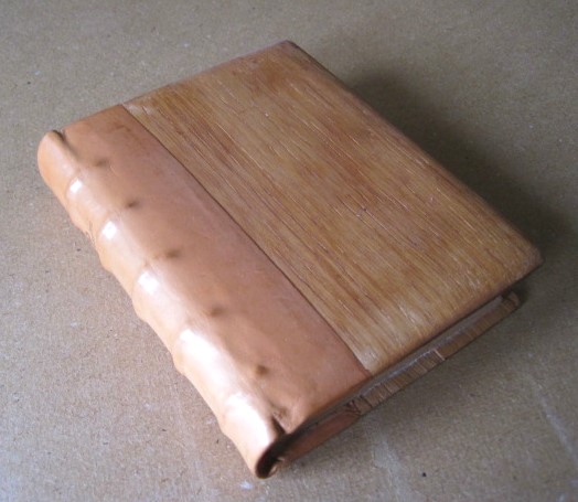
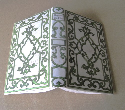
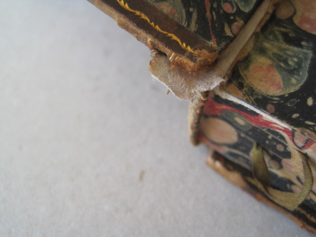
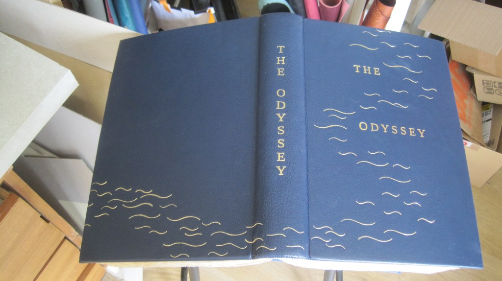
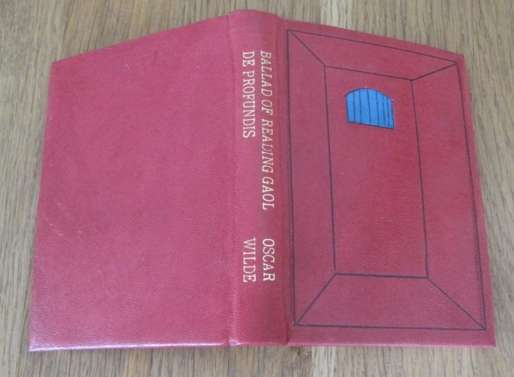
A short piece about sprinkling edges: an earlier post describes my binding of the Marianne Tidcombe study of the Doves Bindery. In fact I had bought two sets of the unbound sheets, back in 1991 (gosh – that’s 35 years ago!) so I think it is time I bound that set up. This time a simple binding on four tapes in a plain vellum case with Yapp edges and linen ties – rather like the Keats binding described in the ‘A Kelmscott Keats Facsimile’ post back in October 2021.
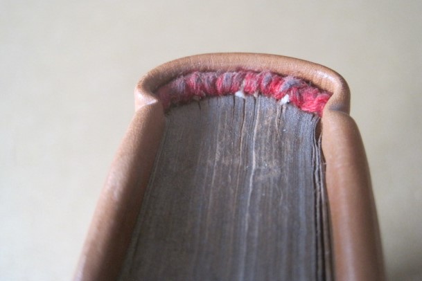
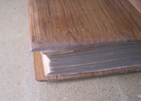
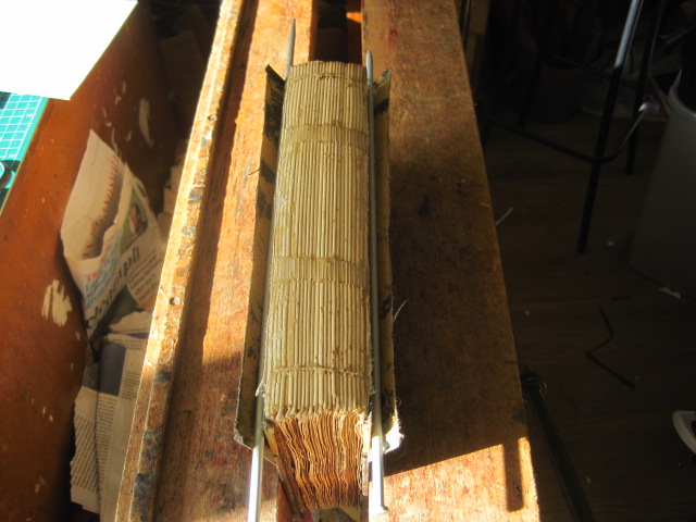
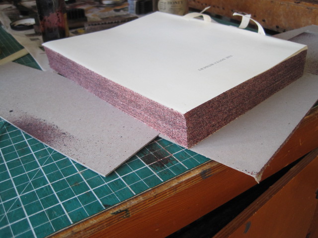
The first decorative decision, after sewing the sections together and ploughing the edges is what to do with the edges. The options are edge-gilding, sprinkling, plain colouring or nothing at all. Any of these is a valid choice for a book that will end up in a plain vellum case. But one page has an illustration that is ‘bled’ to the fore-edge (page 377). This black edge might show on a gilded edge, a plain edge or a plain coloured one. But it does not show on the sprinkled edge of my previous binding.
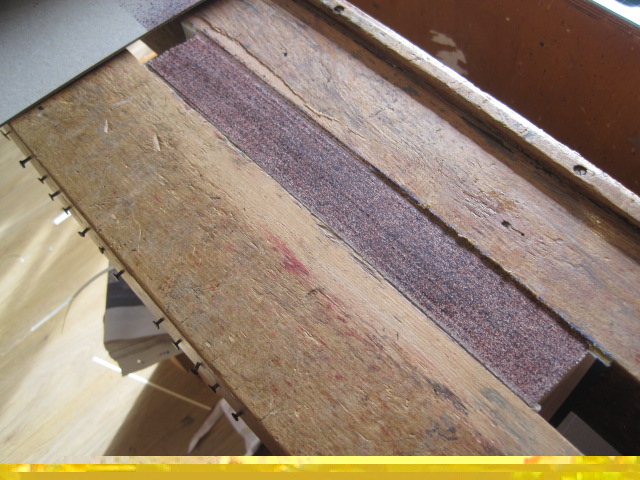
So, sprinkling it is. I must emphasize that this decision should be made immediately after ploughing the edges, while the book is still tight in the lay press, so that the perfectly smooth cut edge is not disturbed at all. That way the sprinkled stain falls on a perfectly flat and tight surface and does not ‘leak’ into the page surfaces.
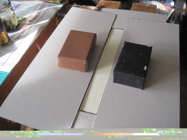
I decided on two colours, red and very dark brown. Pieces of card are taped down around the exposed edge so that the sprinkle does not stain the press cheeks
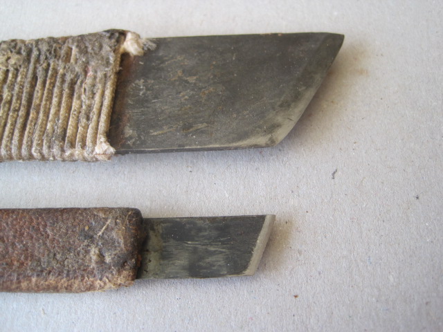
The materials required are a spatula, a toothbrush, a couple of old brushes, red and dark brown spirit stain (I use Fiebings) and waste paper.

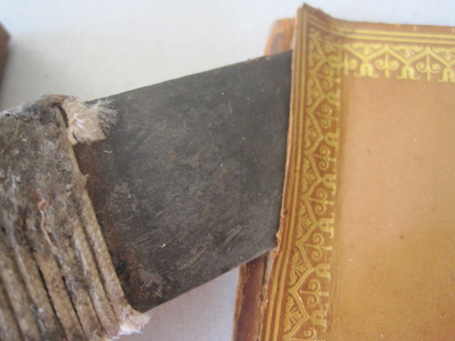
The sprinkle is achieved by striking the edge of an old knife or spatula away from you with a brush dipped in stain, most of which is tapped out on waste paper first.
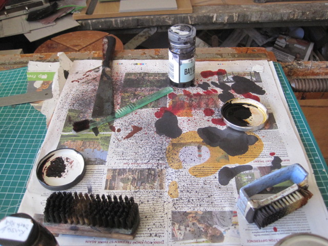
Spatula top left with old toothbrush below it. Spirit stain in old tin lids, coarser brushes if needed, waste paper for tapping off surplus stain and testing the fineness of the drops. The spatula is moved steadily up and down the edge while the brush is struck with even force to begin with, increasing the force as the brush loses stain.
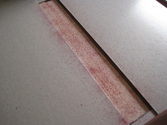
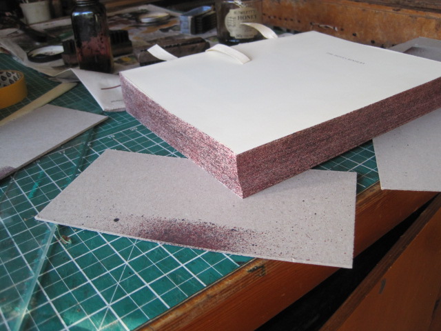
Second coat, with the masking card removed.
Practice is essential to achieve an even distribution and density. Try it on cheap text blocks from charity shops.
When I have made the vellum case and attached it to the book I will show the result.