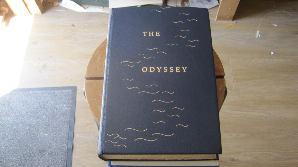
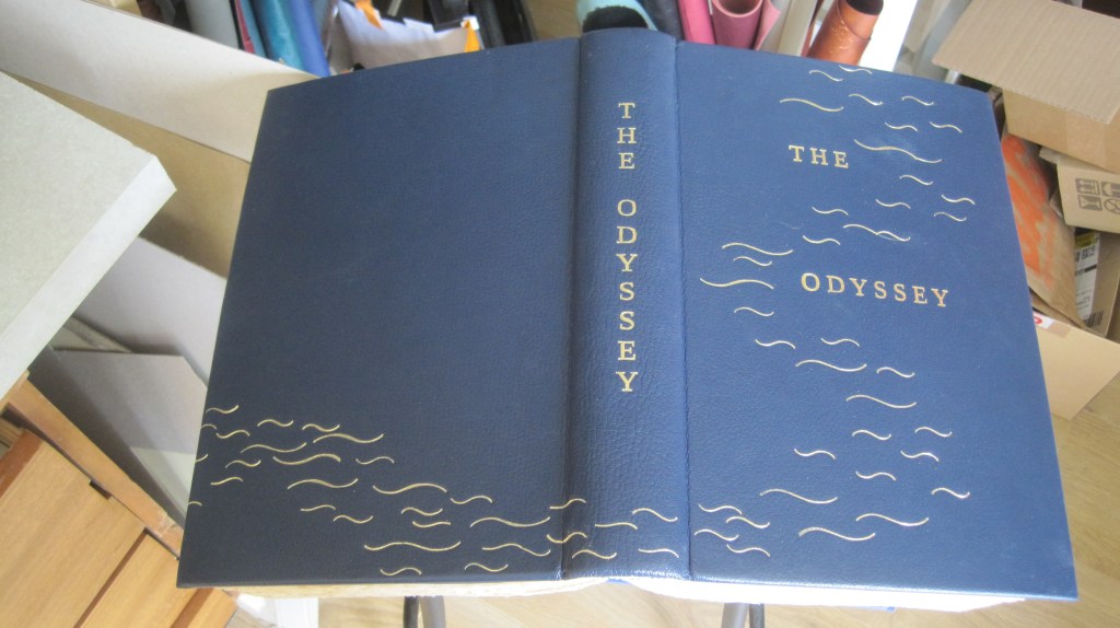
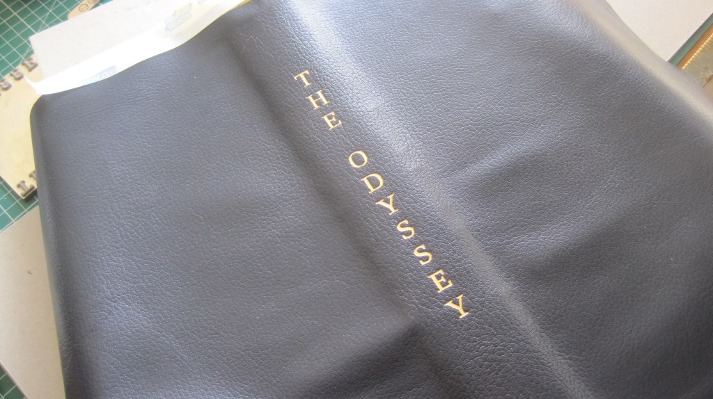
Act in haste – correct at leisure

Yesterday I gave a talk at a meting of the Society of Bookbinders in Taunton. The theme was ‘Twenty bindings across fifty years’ – showing a progression from no skill, no tools and no design ideas to something at least satisfying.

Taunton is 75 miles away so I checked the traffic reports and was warned of possible delays on the Motorway, so I left in a bit of a hurry, taking three boxes of books but leaving one behind that contained three of my earliest bindings. Aaaaargh!! So this post is to fill in that gap.

The first binding I intended to show was to highlight the ‘no skills, no tools’ point:

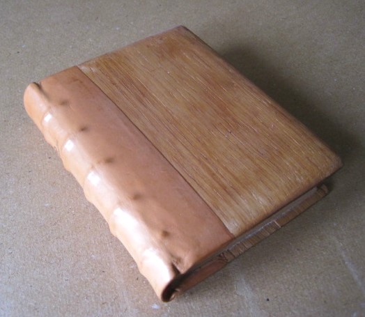
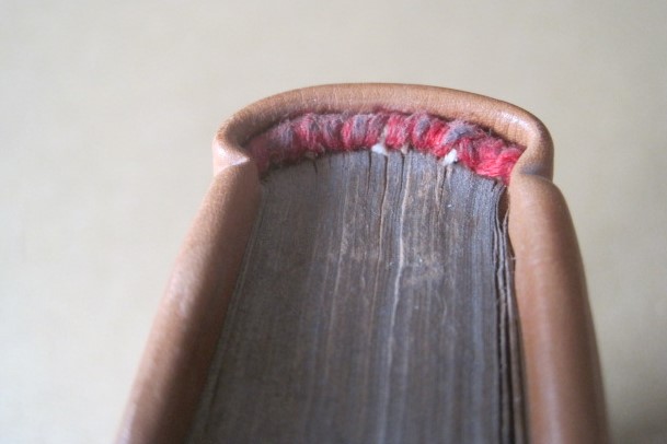
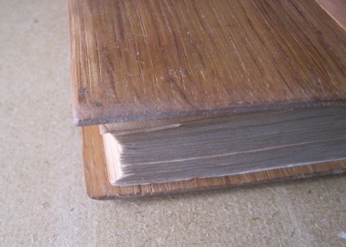
A small Book of Psalms, from the Temple Bible series, re-bound in a piece of plain calf over oak boards made with simple woodworking tools (handsaw, hand drill, rasp, sandpaper). Clumsy headband, ‘squares’ not even. But it does work as a readable book.

Next, an attempt at decoration without any tools at all:

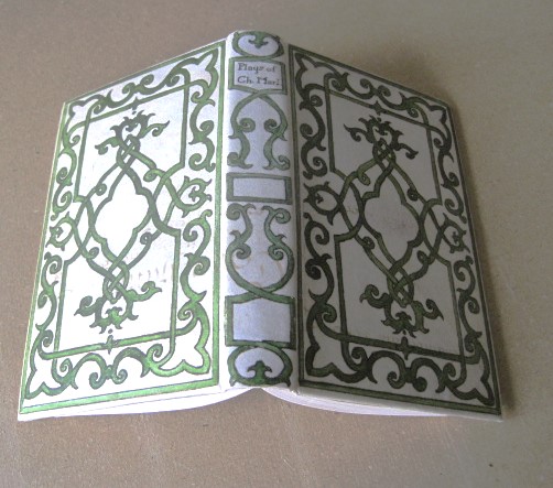
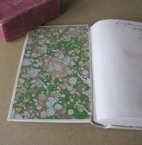
A copy of the World’s Classics edition of the Plays of Christopher Marlowe that I had at school. Original covers re-covered in 1979 in a piece of parchment from a discarded deed. The decoration is copied from an auction catalogue image, drawn in black ink and coloured with gouache watercolour. The marbled paper lining to the covers is not right for the date of the plays. At the time I was very pleased with it.

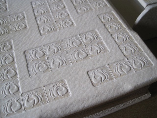
It was five years before I bought my first finishing tools: a pair of ‘grotesque’ stamps made by P & S for me from an image from Gibson’s ‘Early Oxford Bindings’. I used them to decorate the tawed pigskin covers of a copy of Beowulf. Partly bevelled boards, raised double bands, sewn headbands. Matching slipcase in cream bookcloth. I liked it at the time, and I still do. The binding was done in 1980, five years after I started to learn the craft.

Those three books should have been the first part of my talk. Those who heard the rest can now see it here.

The Odyssey, and heresy, continued, and concluded

After blocking the title on the spine the book is covered. The spine is attached to the hollow on the back of the text with a mixture of paste and glue so the fine adjustment can be made to position it accurately. Before the sides are put in place the corners of the leather must be prepared so as to give a neat finish (see earlier post ‘It was going so well’)

A small arc of leather is scooped out enabling the turned corner to be pressed flat

Now for some more heresy. The traditional way to ‘put down’ the sides is to dampen the outer surface, apply two coats of paste to the flesh side, allow it to soak in and then smooth the leather over the sides, turning in the head and tail and forming the headcaps as a continuous process. This approach, sanctified by centuries of use, has at least two hazards:

First, the damp leather is very susceptible to surface marking from finger nails, however neatly trimmed, and any tool used for smoothing or shaping;

Second, because the texture of the leather naturally varies depending on its original position on the body of the animal – back, sides, belly, leg – it will stretch differently when smoothed, resulting in uneven shrinkage as the leather dries. This produces uneven warping of the dried covers which has to be corrected afterwards by paper linings. It doesn’t matter how carefully the cover boards have been made, in two layers with paper linings to each, the warping can still vary.

My heretical solution for this book (remember the spine has already been glued in place) is not to damp the leather on the surface and to apply glue, not paste, direct to each cover board, separately. The loose leather is then smoothed down and given a quick nip, between clean boards, in the press. When the glue has dried, say ten minutes, the head and tail can be turned in and the headcaps and corners formed, but in this case with paste not glue so that the leather is malleable.

The boards will still warp outwards a little, but evenly, and this is corrected by the board linings after trimming out the inside of each.

Thin card, close to the thickness of the turned-in leather, is taped to the inside and cut through with a sharp scalpel so as ro go through the turn-in leather as well.
When the cut edges of the turn-ins are removed the piece of card will fit exactly. It is wise to trim a bare millimetre from the hinge edge to accommodate the expansion when pasted – see below:
The card is pasted and naturally curves (so long as you chose a piece with the grain going up-and-down!) and is pressed in place and allowed to dry. It will draw any curve of the cover back from concave to slightly convex.

And then the covers are ready for decoration. As stated in the previous post I will use the same title block for the front cover as was used on the binding for that client a few years ago. The block is fixed to the heated chase which is raised to accommodate the thickness of the book. The book is positioned with low-tack tape and stamped. A good impression first time is important as there might be a slight movement a second time which will spoil the sharpness of the image. This time it worked fine:

Now the freehand ‘waves’ decoration can be applied.

This is as far I have got today – I will extend the design across the base of the spine and on to the back next.

And here is the result:

It is tempting to keep adding, but I think that’s enough.

An ending for an Odyssey

Six years ago I posted the first part of the work on my own copy of the 1931 Limited Editions Club ‘Iliad’ (see ‘It was going so well…’). I still have the book, but I also have its companion volume of ‘The Odyssey’ and I have finally got round to re-binding it – like the Iliad it had a plain cloth binding that in no way does justice to the quality of the printing and the paper.

In fact a couple of years ago I bound another copy of the same edition of the Odyssey for a client who was pleased with the design I put on it:

The covers are plain blue buckram cloth. The simple design suggests a circuitous sea journey. The titles were blocked.

I will use the same design idea for my copy but for the covers I have a good piece of dark blue morocco goatskin and I will use the same blocks for the spine and cover titles.

Now for a bit of heresy: surely a ‘fine’ binding must be hand lettered? Nonsense! First of all it is fiendishly difficult to hand letter vertically and to achieve an even depth of impression – important with gold work as uneven impressions reflect light differently. But a metal block gives perfect spacing and perfectly even depth.

There is still a challenge, though. You can block on to a flat cover, so long as your blocking press can be raised high enough to take the thickness of the book – my old Mackay press certainly can – but how to block on a curved spine?

The answer is to block the spine before covering the book. It takes care to position the impression exactly in the vertical centre, and there has to be a firm lining to the leather so as to get a sharp impression from the block.

Carbon impression with centre line marked
Centre line of the lined covering leather with a nick exactly in the middle at top of the turn-in edge (both top and bottom). The leather is turned over and taped down to align with the centre line on the carbon impression.

The result is sharp, perfectly aligned, and ready for covering.

With luck, it will be done by next week.