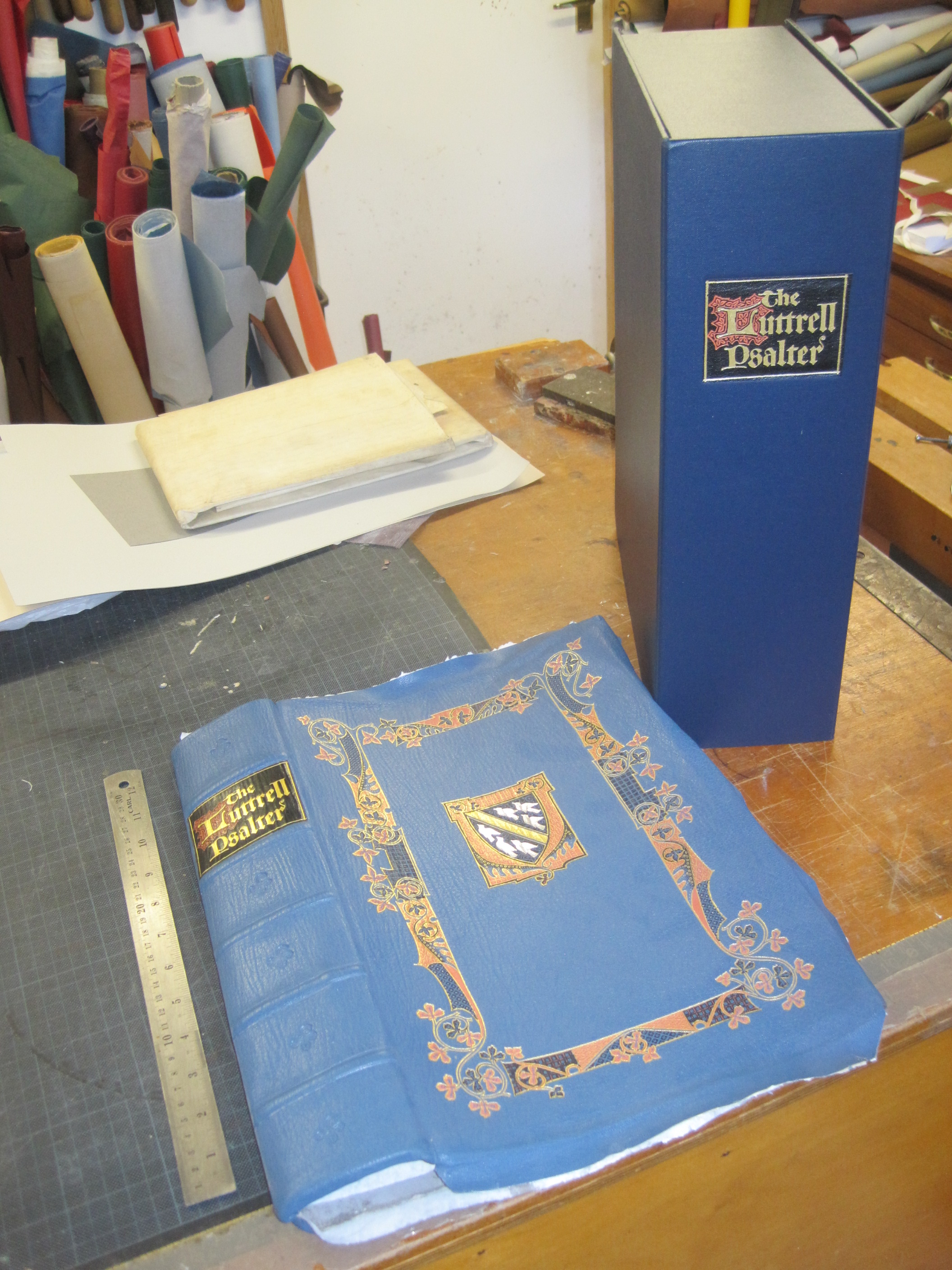
This blog is chiefly about rescuing redundant or rejected books, either for myself or for other people. Now, I am fortunate to live not very far from a specialist book auction firm, Dominic Winter, whose salerooms I have haunted for over 20 years. Their sales always include books rejected by book dealers, or by their owners or inheritors, and I have picked up some good bargains over the years.
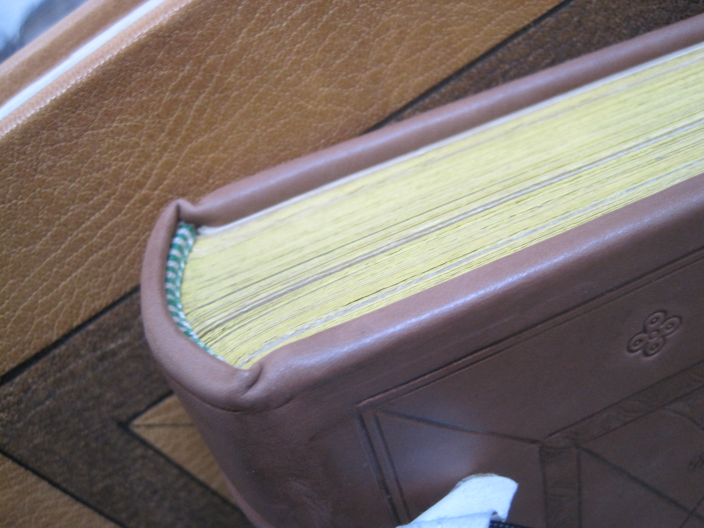
A case in point was a very scruffy copy of a facsimile of the First Folio of Shakespeare’s plays. Scruffy as regards the binding, that is, not the Shakespeare text, which is complete. I bought it for about £80 back in 2011, and put it on a shelf in my bindery for attention in due course. ‘Due course’ was several years later (of course!) when I did a bit of research on it and found it was printed in 1866 by Day and Son and was the first ever full-size facsimile of the First Folio, made from zincographic plates from the copy owned by Lord Ellesmere and held in the British Library in London.
It seemed to be worth re-binding properly as there were very few copies listed for sale (there still are very few – only two as at today’s date on the net, both in the US and priced at $1500 and $450 respectively and both in pretty shabby bindings). An on-line check of the catalogue of the Folger Library in Washington DC produced full bibliographical details and showed that my copy lacked the 1866 printer’s title page but was otherwise intact. There were some scattered spots on a few pages at front and back but otherwise the text was clean and fresh and the paper of a good tone for the period – unlike the other full-size facsimile, the Norton Facsimile, printed in 1968 on rather bright white paper.
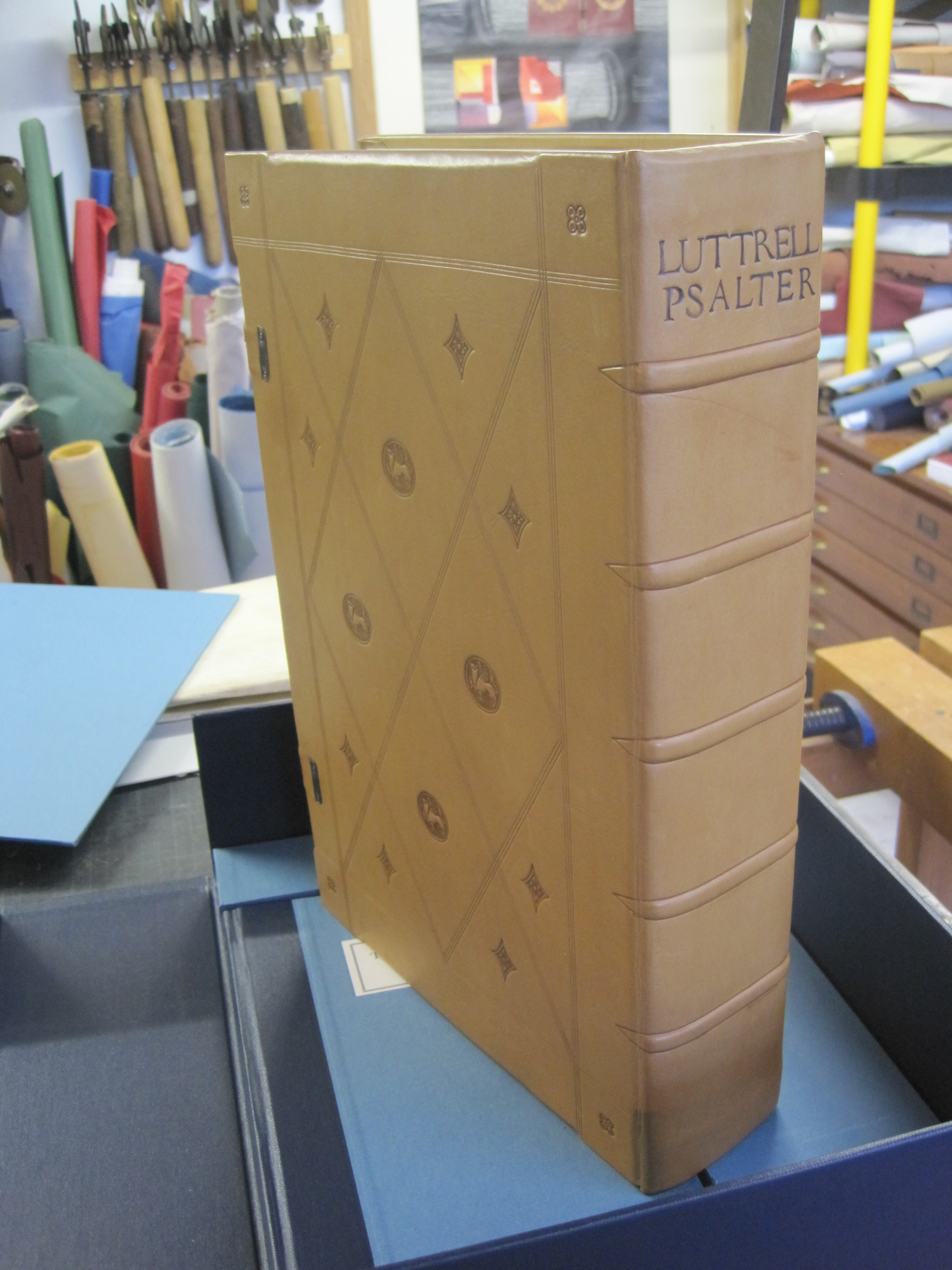
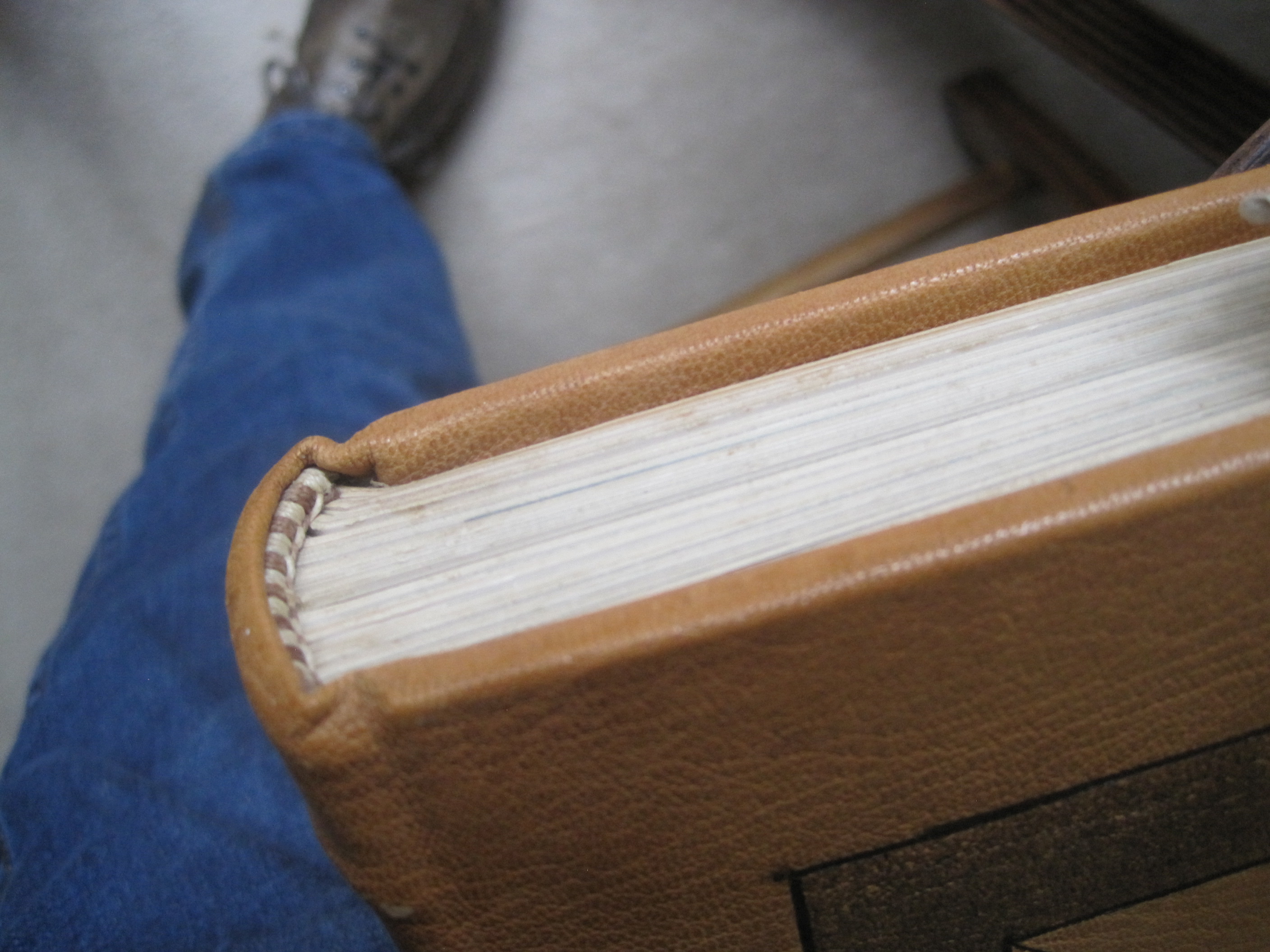
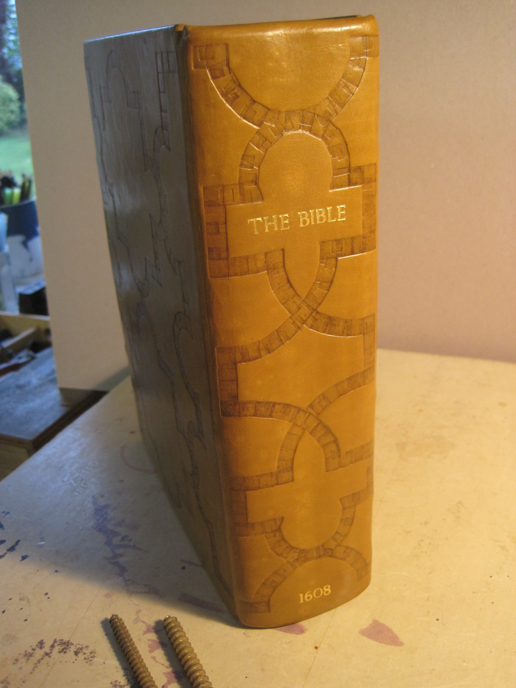
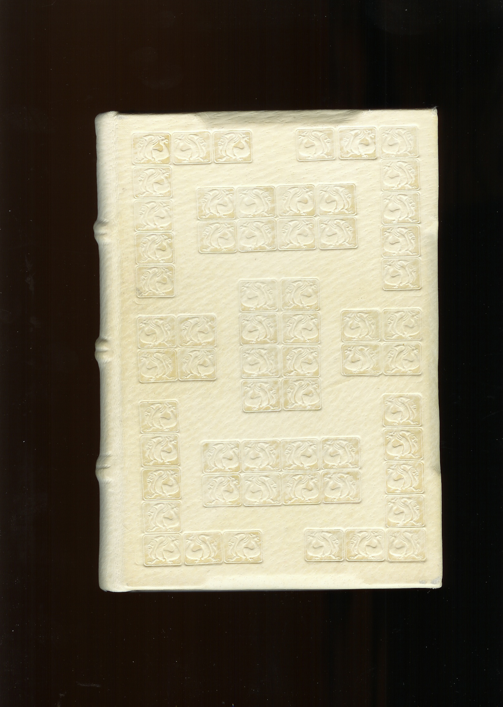
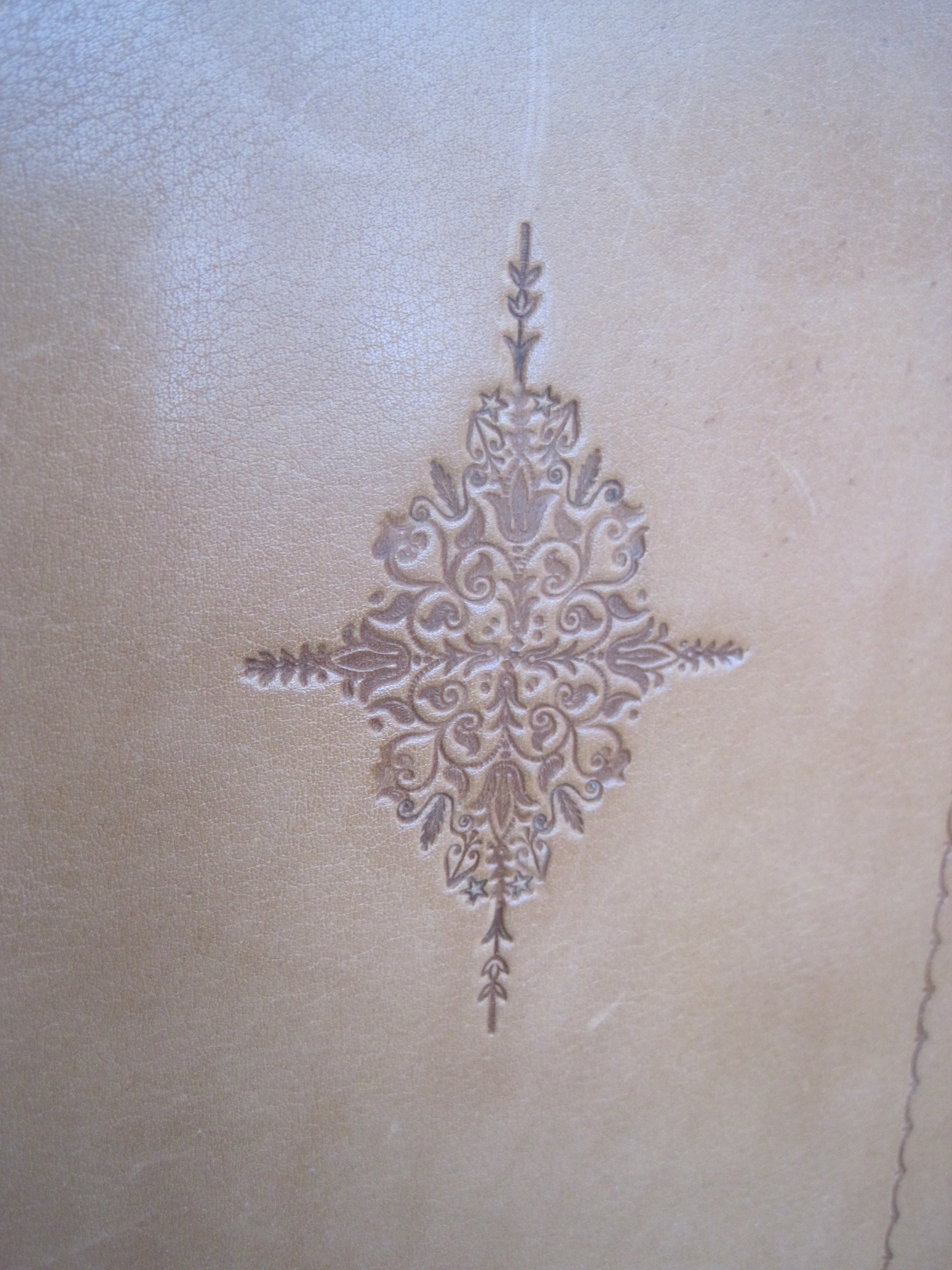
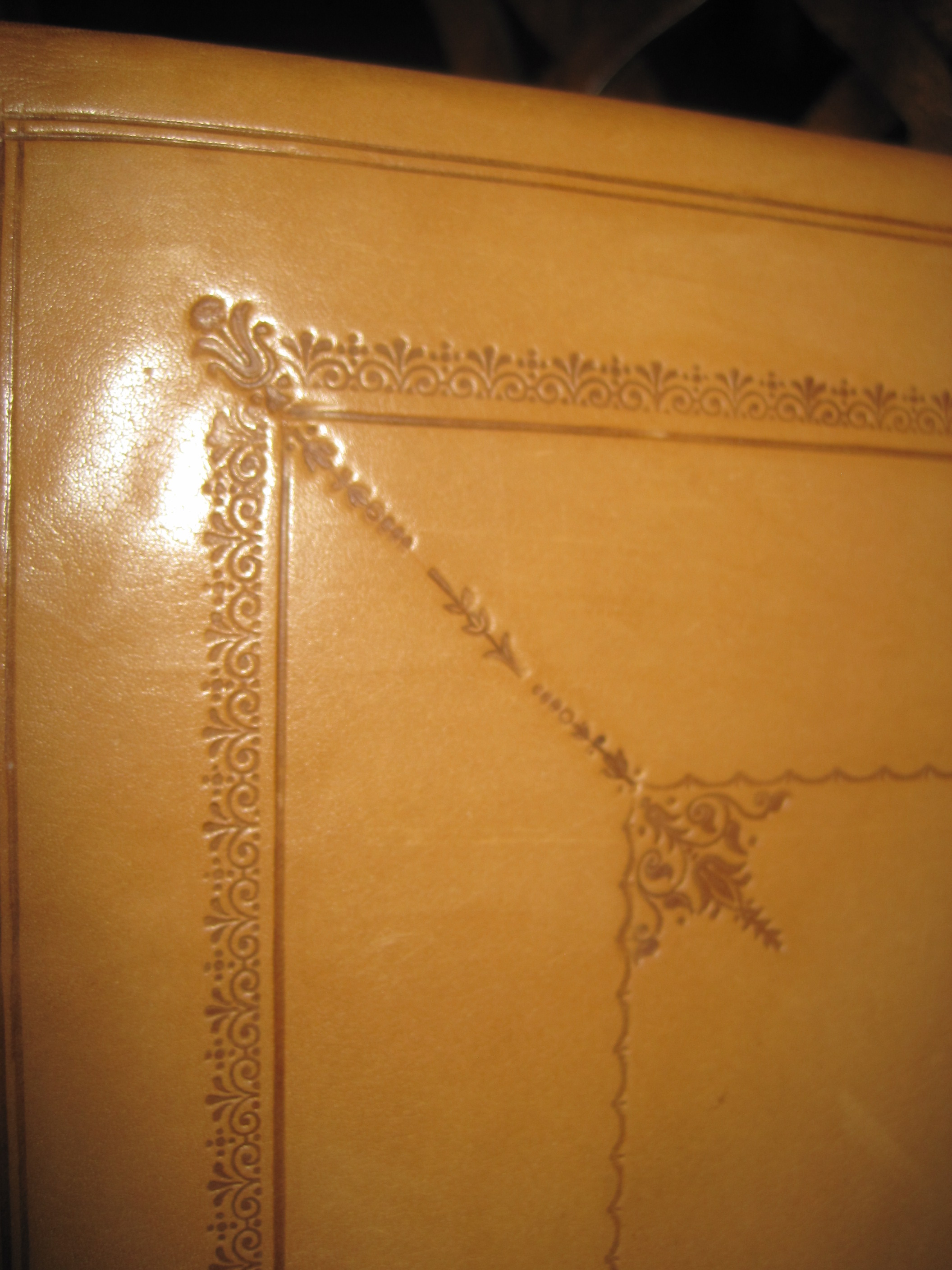
So, how to bind it? Natural calf would be right for the publication date (1623) and blind tooling appropriate, to a design cribbed from images of contemporary English bindings. Here is what I came up with
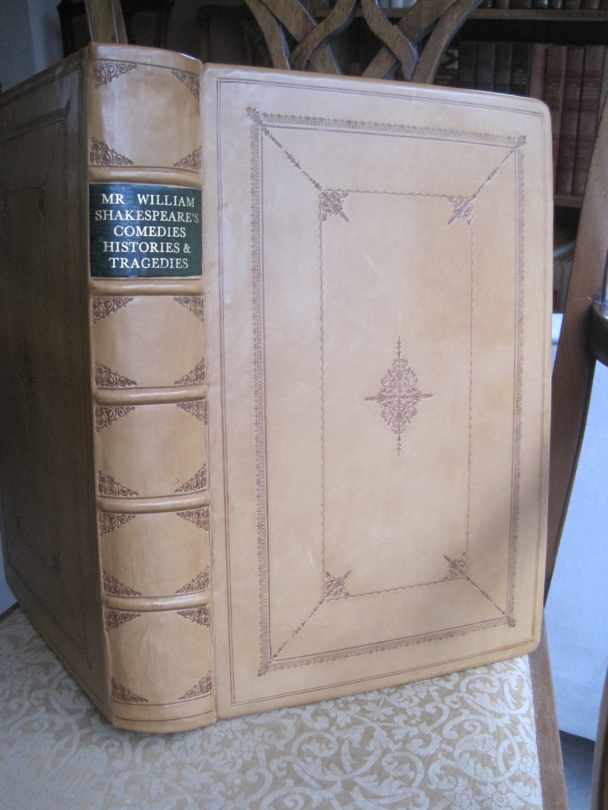
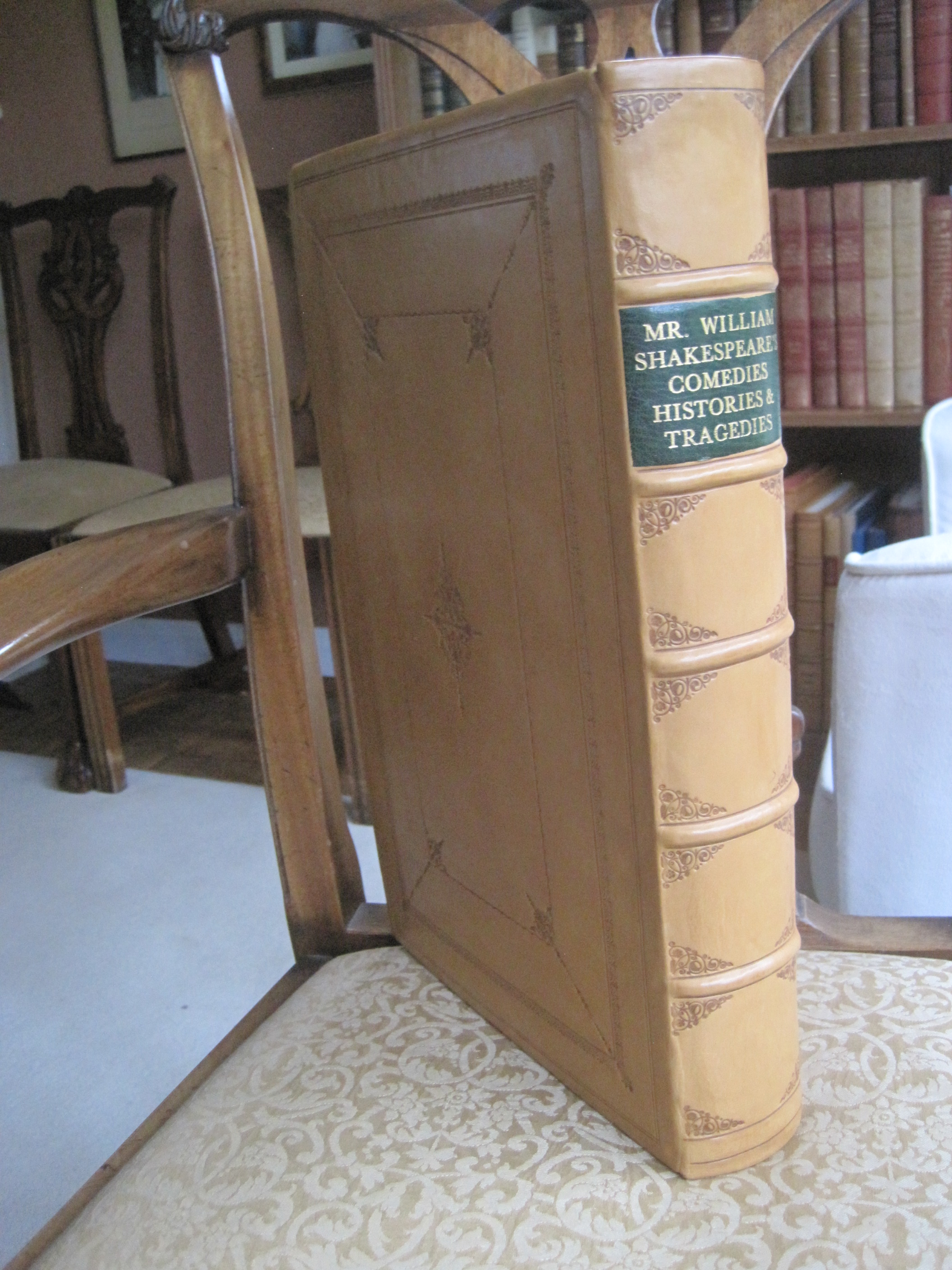
The tooling uses two creasers, two decorative rolls, one pair of corner tools (on the spine) and only four other tools from which the centre-piece and corners are made up, plus tiny heart and star tools
The last real First Folio to be sold fetched nearly £3 million, in 2006. Of the estimated 750 copies printed 219 are known to have survived, 82 of them in the Folger Library. 46 are in the UK. There are several copies of the Day facsimile in the UK, mainly in libraries.
I am open to offers for mine!