Looking back through my work book I see that about half the repairs I have done include the request ‘leather title label, gilt’. So, over the years, hundreds.
Douglas Cockerell said…’books have to be recognised by their titles and it is of the utmost importance that the lettering should be as clear as possible and should fully identify the volume’ (Bookbinding and the Care of Books, p 221). Pretty obvious really, so it’s surprising that there is very little guidance in manuals of bookbinding technique on how to make ‘lettering pieces’ (i.e. labels) or how best to word them.
But Cockerell does have a good deal to say about lettering and letter spacing, as does Arthur Johnson – all good stuff, of course.
Looking at recent manuals, neither Jen Lindsey (‘Fine Bookbinding, a technical guide’, 2009), nor Kathy Abbott (‘Bookbinding, a step-by-step guide’, 2010) mention book titles at all. I guess that’s because both books are about forwarding only, not finishing, though neither actually says so. Arthur Johnson refers briefly to coloured lettering pieces but not how to make them. Eric Burdett has nearly a whole page (page 252) which is helpful as far as it goes, but that’s not far. Going back to Paul Hasluck (1902) you will find about half a page (pages 62/63) about ‘lettering pieces’ of ‘smooth morocco’ on calf bindings in a contrasting colour. But no word about how to prepare them, or letter them on the book. Harrison (Bookbinding Craft and Industry) has half a page on lettering but does not mention separate labels (‘pieces’) at all, in spite of the fact that when his book was written every trade bindery was putting lettering pieces on most of their half or quarter calf bindings.
Only Joseph Zaehnsdorf (‘The Art of Bookbinding’, 2nd. edn. 1890) gives guidance: “For lettering pieces, take morocco of any colour, according to fancy, and having wetted it to facilitate the work, pare it down as thin and as evenly as possible. Cut it to the size of the panel or space it is intended to fit. When cut truly, pare the edges all round, paste it well, put it on the place and rub well down” (page 136). He goes on, helpfully, “I must caution the workman not to allow the leather to come over on to the joint, as by the frequent opening or moving of the boards the edge of the leather will become loose”.
This is what I am talking about:

Now, all labels were lettered with individual handle letters until the early 19th century when typeholders came in to use. And blocking presses were not used for labels I believe until relatively recently. But they do the job very well – and accurately and quickly – so I use mine all the time for labels which I prepare myself, using various sizes of brass or lead type.
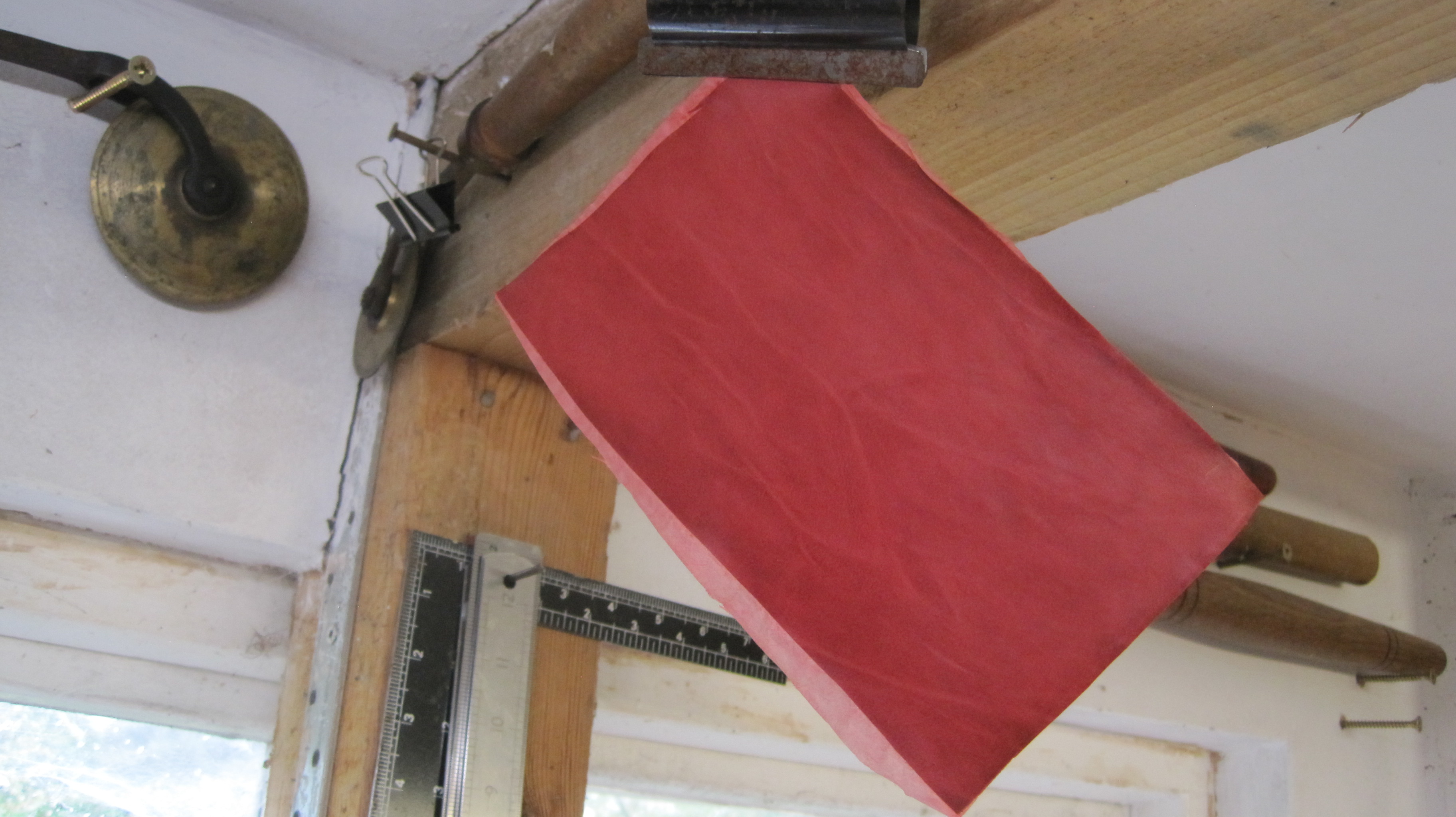
I make my own labels and never use skiver. Take a piece of good smooth leather (goat or calf but not sheep (roan) and not the soft and spongy bits around the belly of the skin, or the tough bits at neck and tail) and big enough to clamp on the stone and work comfortably on.
Pare as thin and evenly as you can, taking care to frequently remove crumbs from underneath. Paste both sides with smooth fresh paste and lay the flesh side on a sheet of tissue paper. Place between clean acetate or mylar/melinex sheets and press hard between smooth boards or tins in the nipping press for a few seconds. Tale out and hang up to dry.

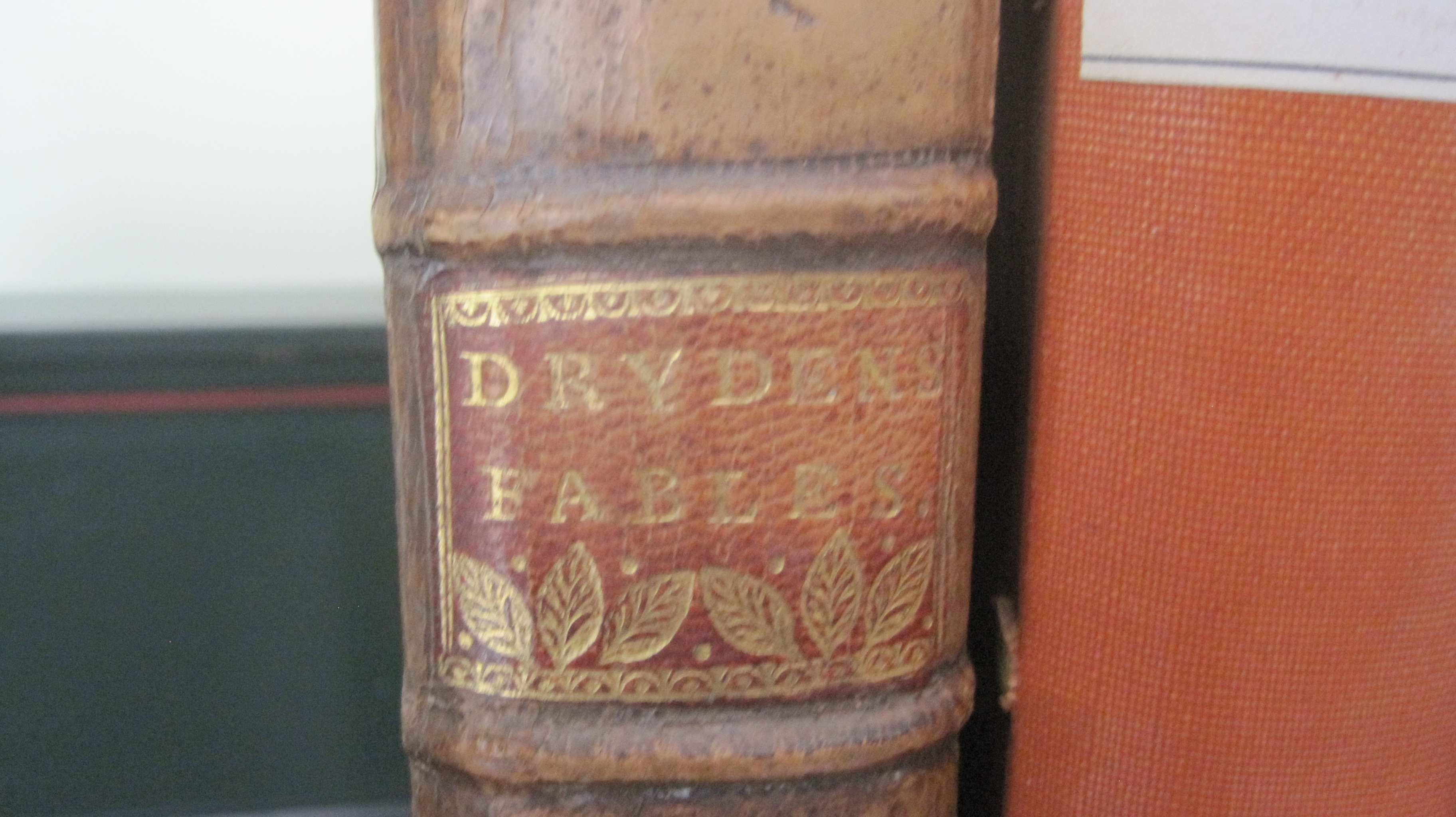
The examples below illustrate the importance of selecting the right size of type, and of good letter-spacing. The Diehl label type should have been one size larger and the word ‘Diehl’ spaced with 2mm board slips between each letter. Similarly the Markham label type is one size too small and the ‘Markham’ needs spacing. The Bradley label is fine, as is the Selected Poems, though the word ‘poems’ perhaps needs 1mm spaces between the type letters.

After blocking the label in the blocking press it is cut to size, edge pared all round and the place in which it is to fit is roughened with a nail board or sandpaper so the glue (not paste) takes well. Paste will soften the label and when rubbed down to fix it in place the impressions of the type will be lost whereas glue on the tissue backing does not soften the leather. Retaining the impression (or do I mean ‘illusion’?) of stamped letters is important, especially for older books.
When the label is to go on a smooth back the exact area it is to cover should be depressed with a small polishing iron so that it lies flat. It is normal practise to seal the top and bottom edges of the label with a line or decorative pallet.
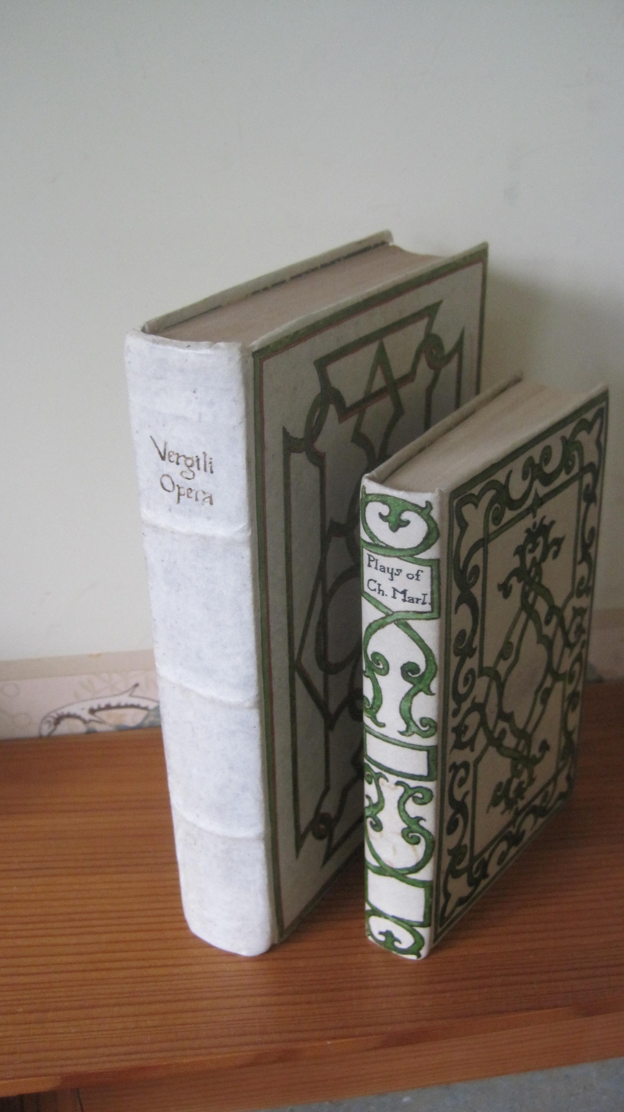
A word about the paper label on the second book from the left: simple to print on a home laser printer, on to reclaimed paper from discarded old endpapers, and very effective on cloth or paper covers.
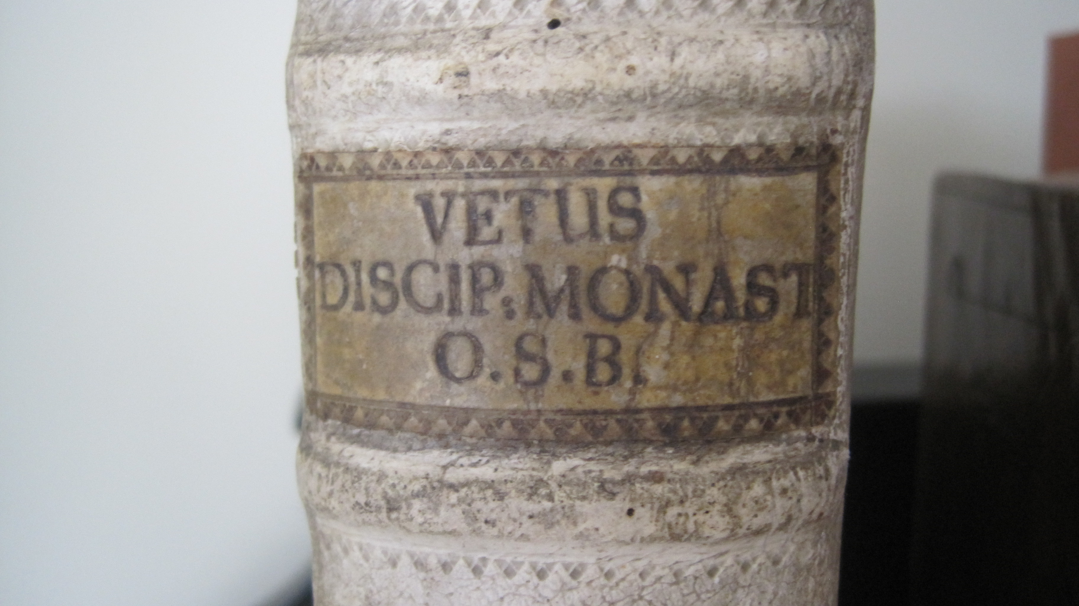
Finally, a couple of old examples of titles:

Please comment, or disagree, or share with others.
